Correlation Ranking Heat Map Basic
Correlation Ranking Heat Map is the correlation indicator based on Correlation Matrix. It provides you the very different form of information from typical technical indicators and analysis you are using right now because it calculates market direction by looking at all instruments in the market. Hence, this fresh piece of information can improve your profit and performance for your trading. In this article, we will introduce very basic concept.
Reading the article is very important if you do not want to lose money by opening some silly positions against obvious market direction. In fact, the technical indicator like MACD, Moving average, RSI, CCI, etc., are good tools but with a lot of disadvantage at the same time because they never look at other data rather than self-data on one single instrument. Correlation Ranking Heat Map literally covers the blind area of all other technical indicators you are using now. It is unique and powerful tool on the market.
Overall Market Direction Recognition
Firstly, you need to be able to recognize strong bullish and strong bearish direction of overall market using Correlation Ranking Heat Map. Say you have D1: 0.554% in EURGBP. This means that currently EURGBP was moved 0.554% in daily candle. The number is how much the price was moved in percentage term. The higher percentage is corresponding to the size of box. Hence, it is important to recognize the area of green or red color. In correlation Ranking Heat Map, green color is corresponding to bullish move. Red color is corresponding to bearish move.
For example, this is how the strong bullish market looks like. Hence, if green area is much greater than red area, this is strong bullish market.
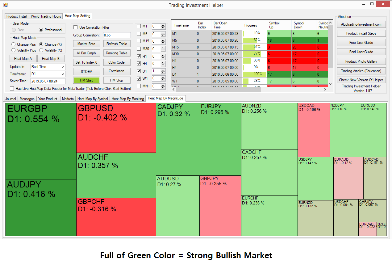
Figure 1
This is how the strong bearish market looks like. Hence, if red area is much greater than green area, this is strong bearish market.
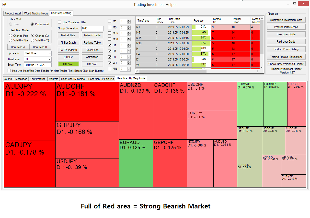
Figure 2
Why it is important to recognize overall market direction? It is because this overall market direction shows the direction of money flow. You often heard that you have to follow the money flow of big guys like investment banks and institutional traders to beat the market. That is correct. Correlation Ranking Heat Map is exactly showing where the money is flowing. To beat the market, you really need to have the big picture like this always. Bet your money where the most of money goes always.
Correlated Group Market direction Recognition
Now another important level of information is the market direction of correlated group. As I have mentioned before, when important market news or economic data released, they will typically affect multiple of instruments. For example, good earning news in Microsoft will lift up the stock price of other similar companies or highly correlated companies too. Likewise, if increasing risk in global economy will increase the value of Japanese yen and Swiss franc, Gold price, etc. Their movements are highly correlated.
Hence, we need to monitor the correlated group instead of watching one single instrument. For example, if you want to trade on GBPUSD, then EURUSD, EURCHF, GBPCHF, GBPJPY, etc. are the correlated group. You can have more of them depending on your data feed. Like before, we need to recognize market direction of the correlated group. Let us stick with GBPUSD example.
For strong bullish market direction of the correlated group will look like this (Green area > Red area).
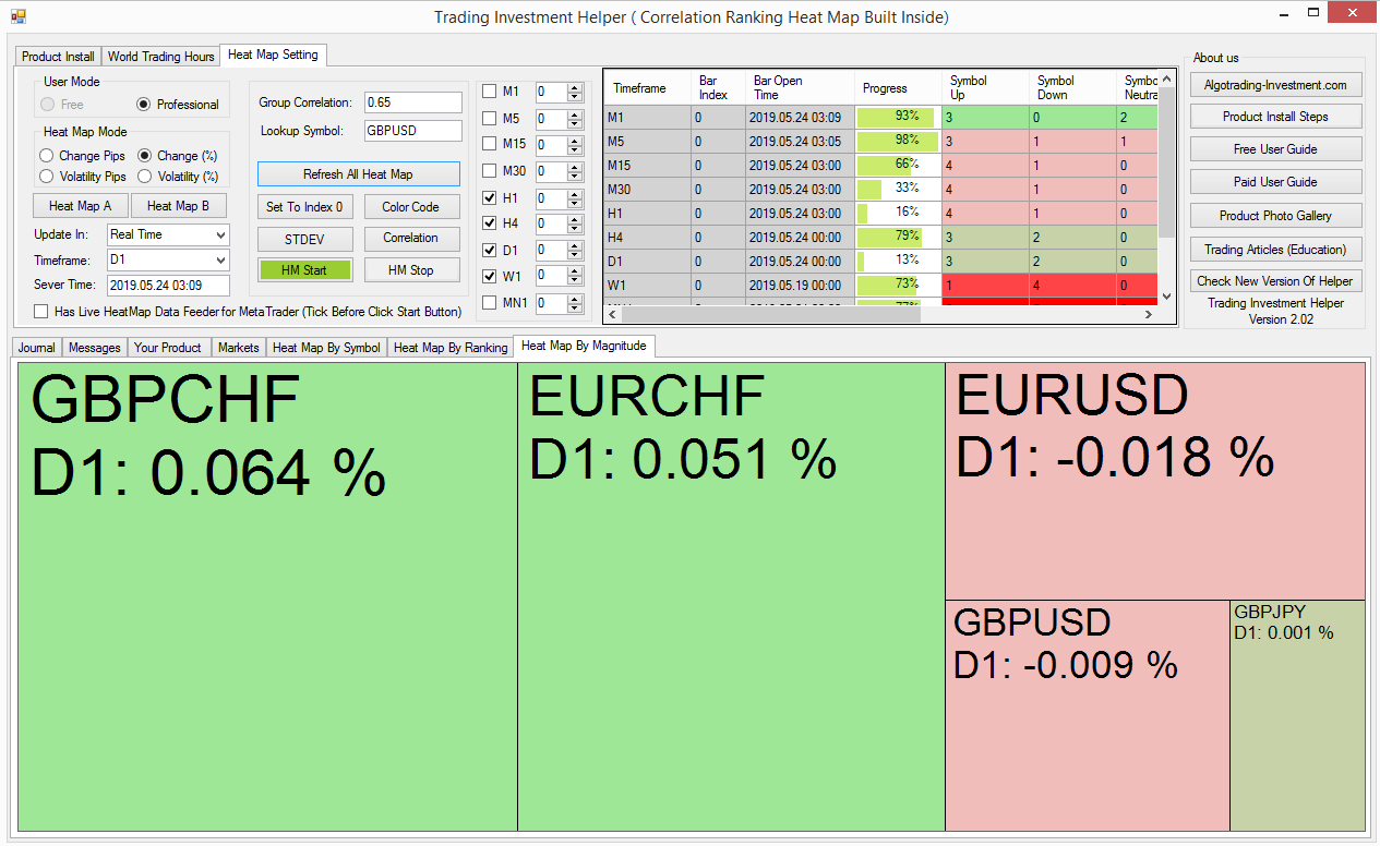
Figure 3
For strong bearish market direction of the correlated group will look like this (Red area > Green area).
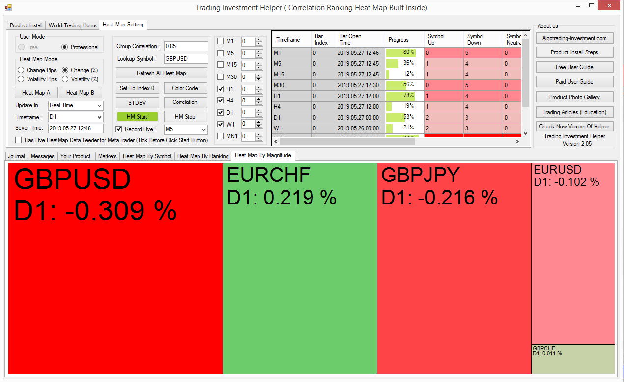
Figure 4
Once again, to recognize the direction of correlated group, you need to check the area of green color or red color.
What you should not do
Say you have the Relative Strength Indicator giving you the oversold signal at 30 on GBPUSD. Now shall we enter the buy position or not? If the market direction of correlated group is too strong bearish, then you should do not buy now. It is too early to enter. Market can go down further because all the other correlated instruments are heavily penalized for the same reason. Wait until the market direction of correlated group is not strong bearish at least.

Figure 5
This screenshot below shows what is happening next if you have entered at buy position at RSI 30. Well initially, it looked like you are enjoying the profit for few minutes. However, it is just one big bearish bar wiping out all your profit + turning your position to loss. I know this is annoying. You get this kind of trades because you are over relying on technical indicators. Always use multiple of evidence for successful trading.

Figure 6
When you trade on other reversal strategy like harmonic pattern or Elliott wave pattern, etc., you can apply the same principle as in this example.
What you should do
Check overall market direction whether they are strong bull or bear. If they are strong bull, then it is much easier to trade with bullish instruments because this is the direction of money flow. If they are strong bearish, then it is much easier to trade with bearish instruments because this is the money flow direction now. It is even better if the market direction of correlated group also agrees to overall market direction.
Data Management in Correlation Ranking Heat Map
In default setting, Correlation Ranking Heat Map uses daily period for calculation. When the market is just opened, you might need to wait at least 1 hour to few hours to check the market direction. In this aspect, this is like Market profile indicator. As you know, you need to wait few hours for market profile indicator to collect some bar data until it shows you the meaningful profile. You can also use Hourly timeframe for short term trading or weekly timeframe for long term trading. I think daily timeframe is most preferred for day trader because daily movement is important.
Free and Paid Version difference
In free version, you can only access to some limited feature. For example, you can only check the overall market direction with 10 minutes lagging data. Of course, in paid version, you can access to full features of Correlation Ranking Heat Map in real time. Therefore, you can get the full benefit of market direction of overall market and correlated group in real time. There is big difference in free and paid version. Paid version is much better. We provide both 1-month rental option and full version. You can find more information here about standalone version of Correlation Ranking Heat Map.
https://algotrading-investment.com/portfolio-item/correlation-ranking-heat-map/
Alternatively, Correlation Ranking Heat Map is the part of Optimum Chart now. In Optimum Chart, you can just use Correlation Ranking Heat Map without incurring separate cost.
Related Products