Introduction to Charting Techniques
For the Price Action and Pattern Analysis, it is important to have good visualization tools. Since we want to find important patterns for our trading, we will need a good size monitor and good visualization software. Of course, you should invest on them as much as you can afford. No single visualization techniques are perfect. They always possess some advantages as well as some disadvantages. Firstly, line chart is the most basic visualization technique for traders. Line is simply drawn by connecting each session’s closing price. For example, 1-hour line chart is simply drawn by connecting the closing price of 1-hour candle. As line chart are produced by connecting two points at the fixed time interval, they can provide a great insight about some regularities in the price series. For this reason, not only traders use the line chart but also many mathematicians use them to visualize the price series data. Line chart is useful when we want to exam some cyclic behaviour like seasonality or any cyclic patterns made up from sine or cosine function. Line chart is also useful when you want to compare multiple price series in one chart. On the other hands, the disadvantage of the line chart is that it does not provide the trading range of each session. In addition, due to the continuously drawn line, it is difficult to see any gap between sessions. In addition, line chart miss some important attributes like highest and lowest prices of each session.
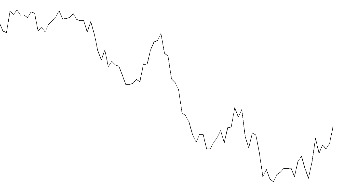
Figure 2-1: Line chart for EURUSD from 1 September 2016 to 16 January 2017
Candlestick chart provides some additional attributes, which line chart misses. Figure 2-2 presents the anatomy of the candlestick chart. Candlestick chart provides three important information. Firstly, the bottom and top of the box represents the opening and closing price of the session. Secondly, each candlestick shows the trading range between high and low for each session. Thirdly, candlestick shows the direction of movement for each session. In Figure 2-2, the green candle reveals the upward movement for the session immediately whereas the red candle shows the downward movement. From Figure 2-3, we can feel how richer information candlestick chart provide for each session comparing to the Line chart. As shown in Figure 2-3, Candlestick chart is useful to spot the gaps in between sessions. This is very useful property of the candlestick chart since Line chart or any other chart is difficult to spot the gaps. One of the drawbacks of the candlestick chart is that it does not provide the sequence of high and low price but this is the common problem for other visualization techniques too. It is simply because the sequence of high and low price was not collected traditionally by the Financial Institutions. If anyone starts to provide the historical sequence of high and low prices for each session, then this would reveal a lot of information on the psychology of the financial market. All they have to put some simple identifier which price comes first between high and low prices during the session. For example, one can put the letter “h” to highlight that high price comes first before low price. Therefore, storing cost is no more than just a letter for this crucial information. This might be cheap but useful alternative to the expensive tick history data, which often require enormous hard drive space. In addition, the candlestick chart is the basis for the popular Japanese candlestick patterns. Although the Japanese candlestick pattern alone does not provide the perfect trading entry, many traders uses them as the confirming tool for their entry or exit.
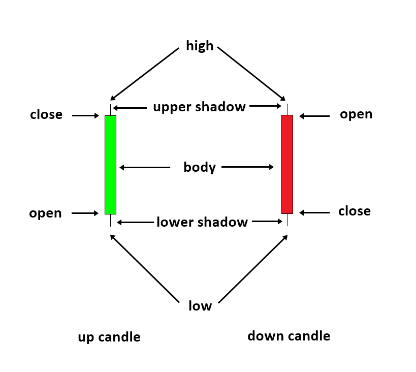
Figure 2-2: Anatomy of the Candlestick chart.
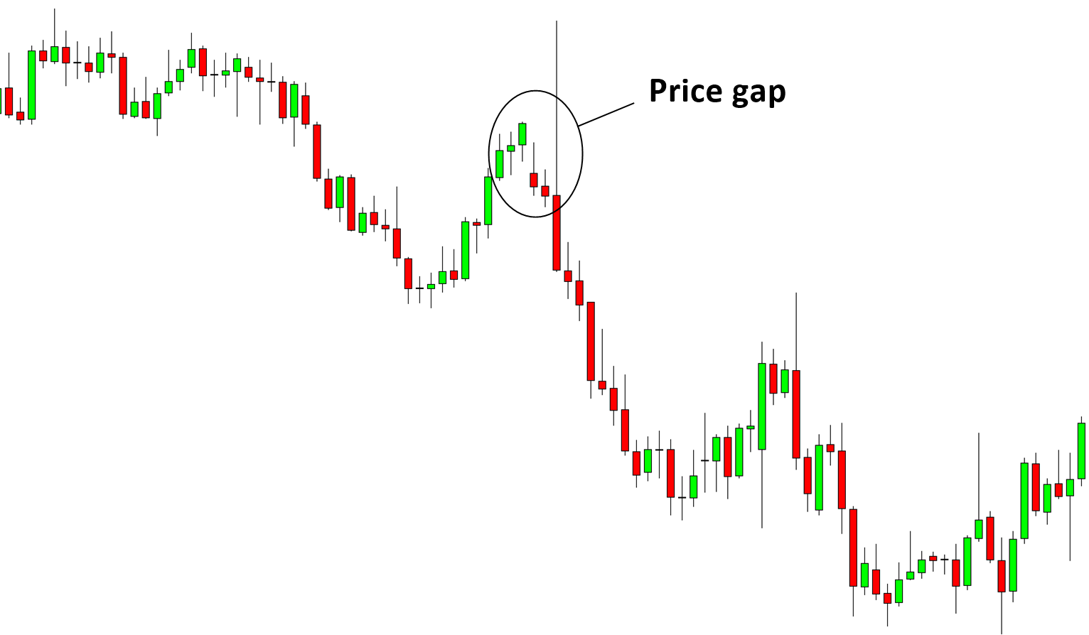
Figure 2-3: Candlestick chart for EURUSD from 1 September 2016 to 16 January 2017.
OHLC Bar chart is another popular form of visualization techniques. The OHLC bar chart has some improvement over the line chart. It provides all of the same data including open, close, range and direction to the candlestick chart. However, OHLC bar chart is not visually easy to follow like candlestick chart. In addition, spotting the gap between sessions is not easy with the OHLC bar chart. However, many traders still not given up to use OHLC bar chart over the candlestick and line chart.
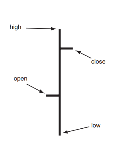
Figure 2-4: Anatomy of the Range Bar.
So far, we have introduced the visualization techniques with the fixed time interval. For example, line chart, candlestick chart and the OHLC bar chart uses the information collected in each session. The common time interval for the session is 1 hour, 4 hour, 1 day, 1 week and 1 month. Instead of using the fixed time interval, several techniques do not use the fixed time interval to construct the chart. For example, tick chart record the open, high, low and close prices during the fixed tick arrival intervals. Therefore, all the bars in the Tick chart have the same tick volumes. For example, 100 Tick chart will record the open, high, low and close price during 100 tick arrivals. All the bars in 100 Tick chart will have 100 tick volumes. One can construct line, candlestick chart and OHLC bar chart with Tick chart too. Tick chart will look like normal chart except that every bar has the identical tick volume. In Tick chart, during busy market hours, one candlestick can be formed fast but during slow market hours, one candlestick can be formed slowly. The tick chart is useful to replace the normal candlestick chart with lower timeframe when the candlestick chart produces the poor visual representation of the market with standard time interval. This is not always the case but when there is low interest in the market, this can happen. For example, Figure 2-5 shows the broken 1-minute candlestick chart for NZDSGD currency pairs. In this case, instead of using the candlestick chart with 1-minute chart, trader can use 100 tick chart. Because each candle is completed with 100 tick arrivals every time (Figure 2-6), we naturally have smoother looking chart in comparison to the broken chart in Figure 2-5. Once traders become familiar with tick chart, they tend to stick with them even for the higher timeframe. For example, you can use 500 tick chart or 1000 tick chart for your trading. Disadvantage of the tick chart is that tick is generally much heavier to store in the hard drive in terms of size. Therefore, not many trading package offer the capability of using tick chart for the time of writing this book. Just for your information, one-year worth of tick data can take up over some serous gigabytes of the space on your hard drives. In addition, Tick chart does not provide volatility information since every bar has identical tick volume. However, if programmatically doable, one can store time duration it takes to form the bar in the place of the tick volume. This would provide different insight, which the fixed time interval chart can’t provide.
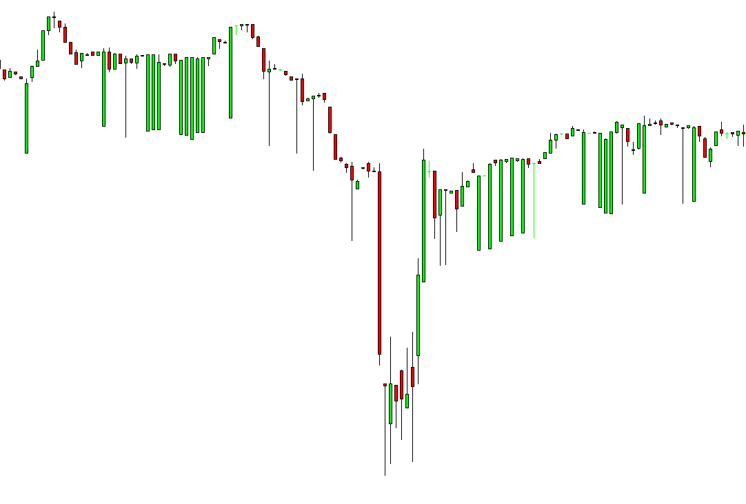
Figure 2-5: Broken candlestick chart for NZDSGD currency pairs in 1-minute timeframe.
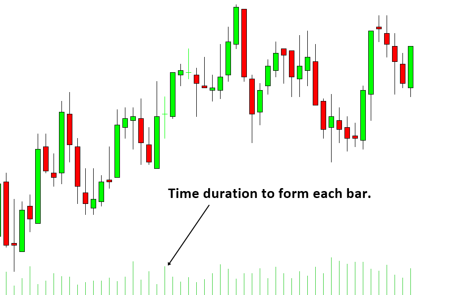
Figure 2-6: EURUSD Tick chat with 100 tick volume. On average, each bar was formed in 182.36 seconds.
Another popular visualization technique, which does not use the fixed time interval, is the Renko chart. The charting principle of the Renko Chart is quite different from the rest. For example, Renko chart is constructed by drawing bricks of fixed height in series. To illustrate the idea, consider Figure 2-7, if the price moved up by 5 points from the top of brick, then we will draw one white up brick. Likewise, if the price moved down by 5 points from the bottom of the brick, then we will draw one black down brick. The brick will be drawn either on the top or on the bottom of the other brick always.
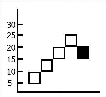
Figure 2-7: Conceptual representation of Renko chart.
Figure 2-8 shows what happens when we transform about 100 candlesticks into Renko bricks with height of 20 pips in EURUSD 1 hour chart. As you can see, Renko bricks are much more concise and 100 candlesticks was transformed into only 52 Renko bricks. During this transformation, we are losing time information of our candlestick chart. Another important point you can observe here is that the Renko chart provide much smoother and readable visualization representation of trend. This is because the equal height of Renko brick reduces a lot of noise present in candlestick chart. With Renko Brick chart, it is much easier to identify trend and reversal patterns.
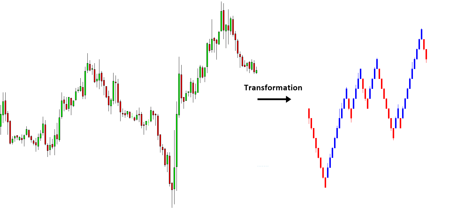
Figure 2-8: Daily EURUSD price series and Renko chart on the same period.
There are some drawbacks in Renko chart too. Because Renko chart lose all time information from our candlestick chart, you are no longer able to compare your normal candlestick chart to your Renko chart. In addition, unlike the candlestick chart, you have to select the sensible height of brick. Since there are many benefits using Renko chart, some traders are never worried about these disadvantages. Overall, Renko chart provide quite a lot of features which other chart does not provide.
Some More Tips about Charting Techniques in Forex Trading
Charting techniques in forex trading involve analyzing price charts to predict future market movements. Traders use various types of charts and technical analysis tools to identify trends, patterns, and key levels. Here are some essential charting techniques in forex trading:
Types of Price Charts
- Line Charts:
- Description: A line chart connects closing prices over a specified time period with a continuous line.
- Use: Simple and useful for identifying overall trends and long-term movements.
- Bar Charts:
- Description: Each bar represents a specific time period (e.g., one hour, one day) and shows the opening, high, low, and closing prices (OHLC).
- Use: Provides more detailed information than line charts, helping traders identify price ranges and trends.
- Candlestick Charts:
- Description: Similar to bar charts, but use candlesticks with bodies and wicks to represent OHLC prices.
- Use: Widely used due to their visual appeal and ability to highlight patterns and price action.
Key Chart Patterns
- Trend Lines:
- Uptrend Line: Drawn by connecting a series of higher lows.
- Downtrend Line: Drawn by connecting a series of lower highs.
- Use: Identifying the direction and strength of a trend.
- Support and Resistance Levels:
- Support: A price level where demand is strong enough to prevent the price from falling further.
- Resistance: A price level where selling pressure is strong enough to prevent the price from rising further.
- Use: Identifying potential entry and exit points.
- Moving Averages:
- Simple Moving Average (SMA): The average price over a specific number of periods.
- Exponential Moving Average (EMA): Gives more weight to recent prices.
- Use: Smoothing out price data to identify trends and potential reversals.
Common Chart Patterns
- Head and Shoulders:
- Description: A reversal pattern with three peaks: a higher peak (head) between two lower peaks (shoulders).
- Use: Indicates a trend reversal from bullish to bearish (and vice versa for inverse head and shoulders).
- Double Top and Double Bottom:
- Double Top: Two peaks at roughly the same price level, indicating potential reversal from uptrend to downtrend.
- Double Bottom: Two troughs at roughly the same price level, indicating potential reversal from downtrend to uptrend.
- Use: Identifying trend reversals.
- Flags and Pennants:
- Description: Short-term continuation patterns that occur after a strong price movement, followed by consolidation.
- Use: Indicate that the previous trend will likely continue after the pattern is completed.
- Triangles:
- Ascending Triangle: Horizontal resistance line with rising support line.
- Descending Triangle: Horizontal support line with descending resistance line.
- Symmetrical Triangle: Converging support and resistance lines.
- Use: Indicating continuation of the current trend.
Technical Indicators
- Relative Strength Index (RSI):
- Description: Measures the speed and change of price movements, ranging from 0 to 100.
- Use: Identifies overbought (above 70) or oversold (below 30) conditions.
- Moving Average Convergence Divergence (MACD):
- Description: Shows the relationship between two moving averages (typically 12-day and 26-day EMAs).
- Use: Identifies potential buy and sell signals.
- Bollinger Bands:
- Description: Consist of a middle band (SMA) and two outer bands (standard deviations from the SMA).
- Use: Identifies volatility and potential overbought or oversold conditions.
Practical Tips for Using Charting Techniques
- Combine Techniques: Use a combination of chart patterns and technical indicators for more robust analysis.
- Backtesting: Test your strategies on historical data to evaluate their effectiveness.
- Stay Updated: Continuously monitor market news and events that can impact forex prices.
- Risk Management: Implement proper risk management techniques, including setting stop-loss orders and managing position sizes.
By mastering these charting techniques, forex traders can improve their ability to analyze market conditions, identify trading opportunities, and make informed decisions.
About this Article
This article is the part taken from the draft version of the Book: Scientific Guide to Price Action and Pattern Trading (Wisdom of Trend, Cycle, and Fractal Wave). Full version of the book can be found from the link below:
Advanced Price Pattern Scanner uses highly sophisticated pattern detection algorithm. However, we have designed it in the easy to use and intuitive manner. Advanced Price Pattern Scanner will show all the patterns in your chart in the most efficient format for your trading. It is non repainting pattern detector. Below are the links to Advanced Price Pattern Scanner.
https://algotrading-investment.com/portfolio-item/advanced-price-pattern-scanner/
https://www.mql5.com/en/market/product/84567
https://www.mql5.com/en/market/product/84568
Below is the landing page for Optimum Chart (Standalone Charting and Analytical Platform).
https://algotrading-investment.com/2019/07/23/optimum-chart/
Related Products