Magnet and Stock Market Experiment
In Forex and Stock market, it is best if you can learn something without incurring too much cost. Unfortunately, sometimes, cost of learning in the financial market could be expensive. Hence, I created two experiments to help you to understand the Stock market and Forex market with the cost of less than 6 dollars.
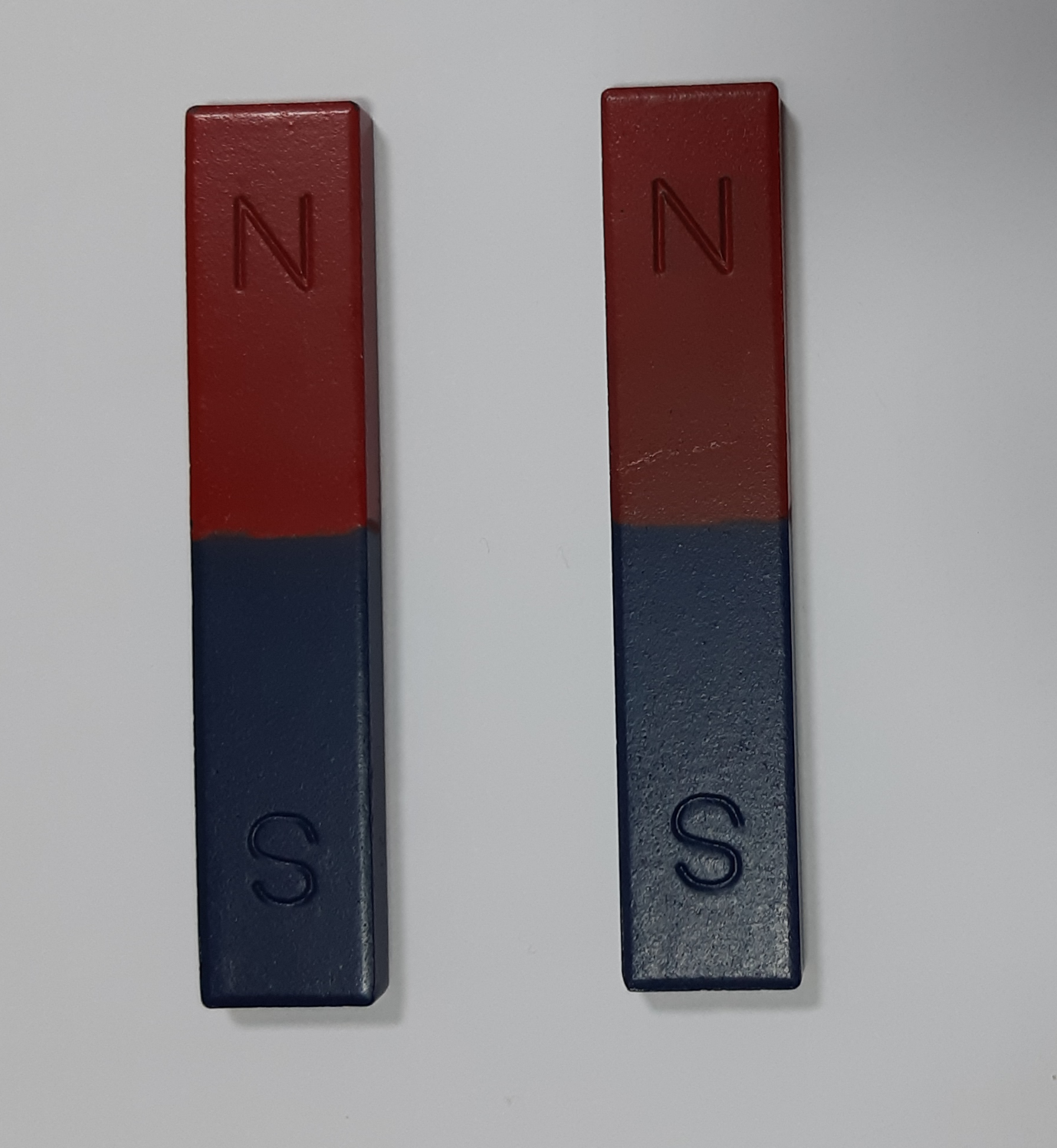
Figure 2-1: Photo of two magnets
In the first experiment, you need to buy two bar magnets and 100 grams of iron filings. These costed me around 5 dollars. You might get these cheaper than 5 dollars. Just straight red and blue bar magnets are fine but the two magnets should be identical in size and shape. Put one of them on the desk. Place a thick white paper, plastic cover or glass cover above the magnet. You might need to place some cubic rubber around the four corner of the cover to keep small distance between the magnet and the cover. Now, scatter the iron filings onto the cover to reveal the magnetic field of the bar magnet. Now the iron filings will reveal the magnetic field of the bar magnet. You should be able to see that iron filings are aligned to make the curvature from North Pole (N) to South Pole (S).
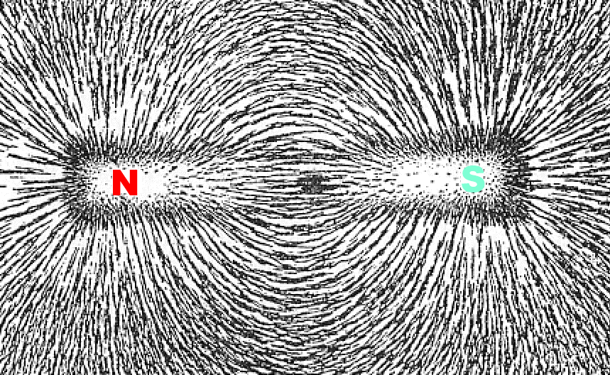
Figure 2-2: Magnetic field of a bar magnet
The magnetic field is not visible to us but we can check their existence with the iron filings. With the iron filings, we can observe that the magnetic field lines go from North Pole to South Pole.
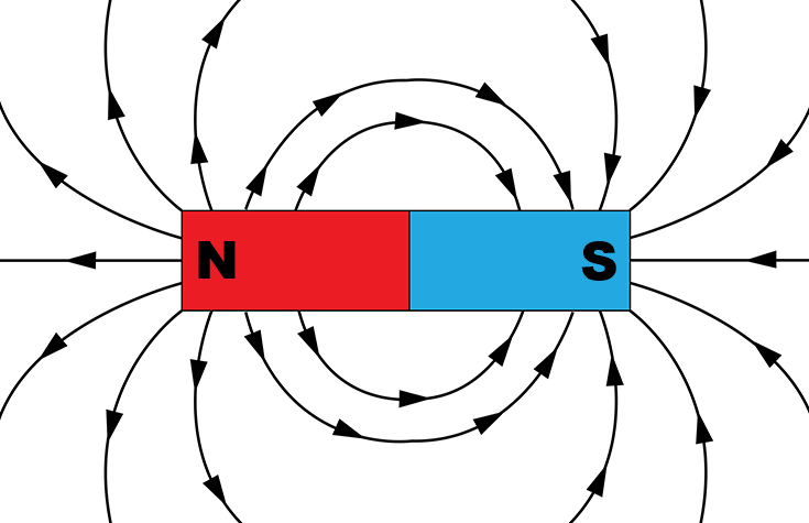
Figure 2-3: Schematic diagram of the magnetic field around the bar magnet
Next, we will break another bar magnet into two pieces. Bar magnet is not hard. Hence, in my case, I hit the bar magnet against the concrete floor. As long as you can break that bar magnet into two pieces, it is fine. Just make sure that you conduct your experiment safely. If necessary, wear some plastic goggles as well as other body protection equipment. Do not break the magnet while other people are around.
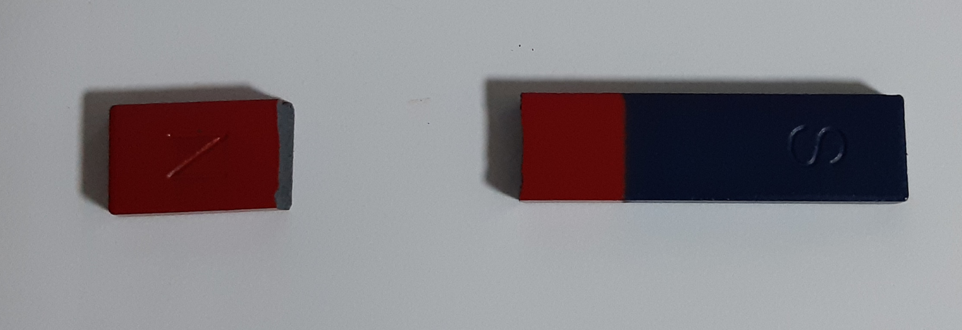
Figure 2-4: Broken magnet
You can place either of the broken magnet on the desk as before. Place a thick white paper, plastic cover or glass cover above the magnet. Now, scatter the iron filings onto the cover to reveal the magnetic field of the broken bar magnet. You should be able to see that the iron filings are aligned to make the curvature from North Pole (N) to South Pole (S) as before.
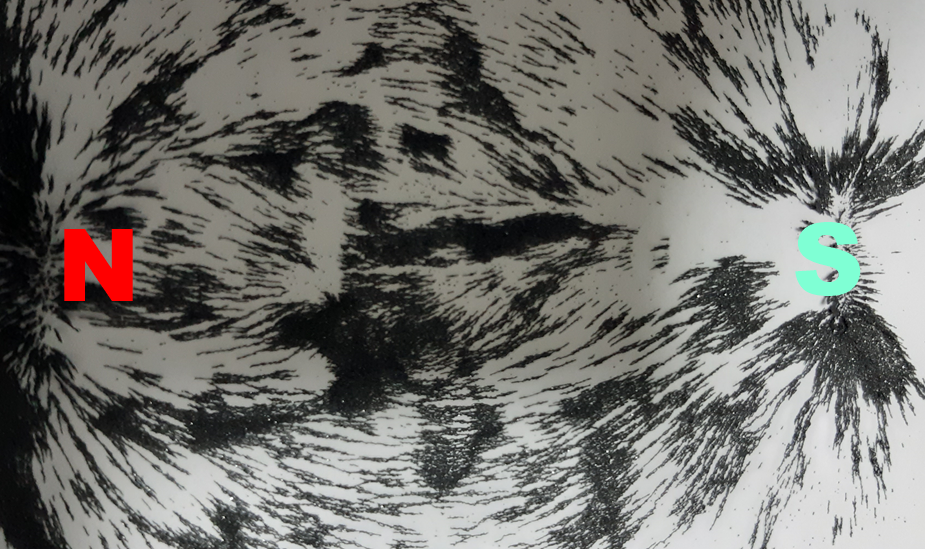
Figure 2-5: Magnetic field of the broken bar magnet
The magnetic field lines from the broken magnet look similar to the unbroken bar magnet. Only difference is that the magnetic field in the broken magnet is smaller in scale. Likewise, if we break the broken magnet into another two pieces, we will get the same results. The magnetic field of the smaller magnet always look similar to the bigger magnet. The shape of the magnetic field will repeat endlessly, regardless how many times you break them. They are just different in scale. We call this process of repeating geometry as Fractal.

Figure 2-6: Conceptual diagram of Fractal behaviour of the magnet
Electromagnetic force is one of the four fundamental forces in nature (i.e. gravity, the weak force, electromagnetism, and the strong force). As we can see from our experiment, this electromagnetic force shows the fractal characteristic. You might guess how widely fractal is spread over the universe. In fact, there are countless fractal examples in our life including Romanesco broccoli, coastline, mountains, snowflakes, structure of our brain and so on. In these examples, the same or similar patterns are occupying the entire structure of an object. Even if they are broken off from the bigger piece, the smaller piece do look like the big piece.

Figure 2-7: Picture of Romanesco Broccoli
Now, we will conduct our second experiment. Firstly, we need to download the historical data for Dow Jones Industrial Average price (=Dow Jones Industrial Average or ^DJI) from Yahoo Finance (https://finance.yahoo.com) or from other similar website. Download the monthly historical data from 1992 February 1 to 2021 October 1 including open, high, low, and close price. You can download daily or weekly data to carry on the same experiment. But the data might be too many to draw on the chart. Hence, the monthly data is fine for the experiment. In my case, I have copied 357 rows of the data in Excel. Now draw the candlestick chart in Excel using the data. If you do not know how to use the Excel, then you can use other charting tool like Yahoo finance or etc. All you need is to print the chart in A4 paper twice from 1992 February 1 to 2021 October 1. You should have two A4 papers with the Dow Jones Industrial Average candlestick chart.
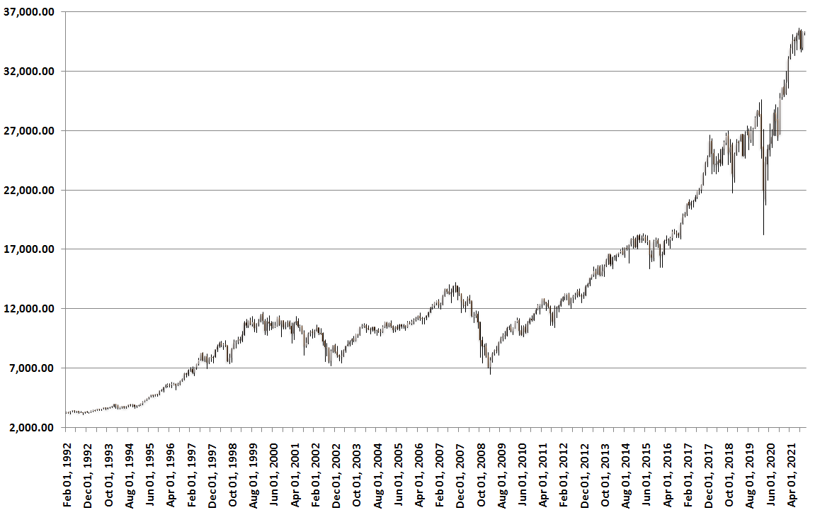
Figure 2-8: Candlestick chart of Dow Jones Industrial Average (www.algotrading-investment.com)
In the first chart, draw small circle at the starting price at 1992 February 1 (Point A). Next, draw small circle at the price before the market decline due to the Covid 19 crisis at 2020 January 1 (Point B). Finally, draw the small circle at the lowest price due the Covid 19 crisis on 2020 March 1 (Point C). Now connect point A, B and C to create one triangle. This is the biggest market cycle we can identify from the data between 1992 February 1 and 2021 October 1. Covid 19 crisis had the large bearish impact in the market cycle of Dow Jones Industrial Average index.
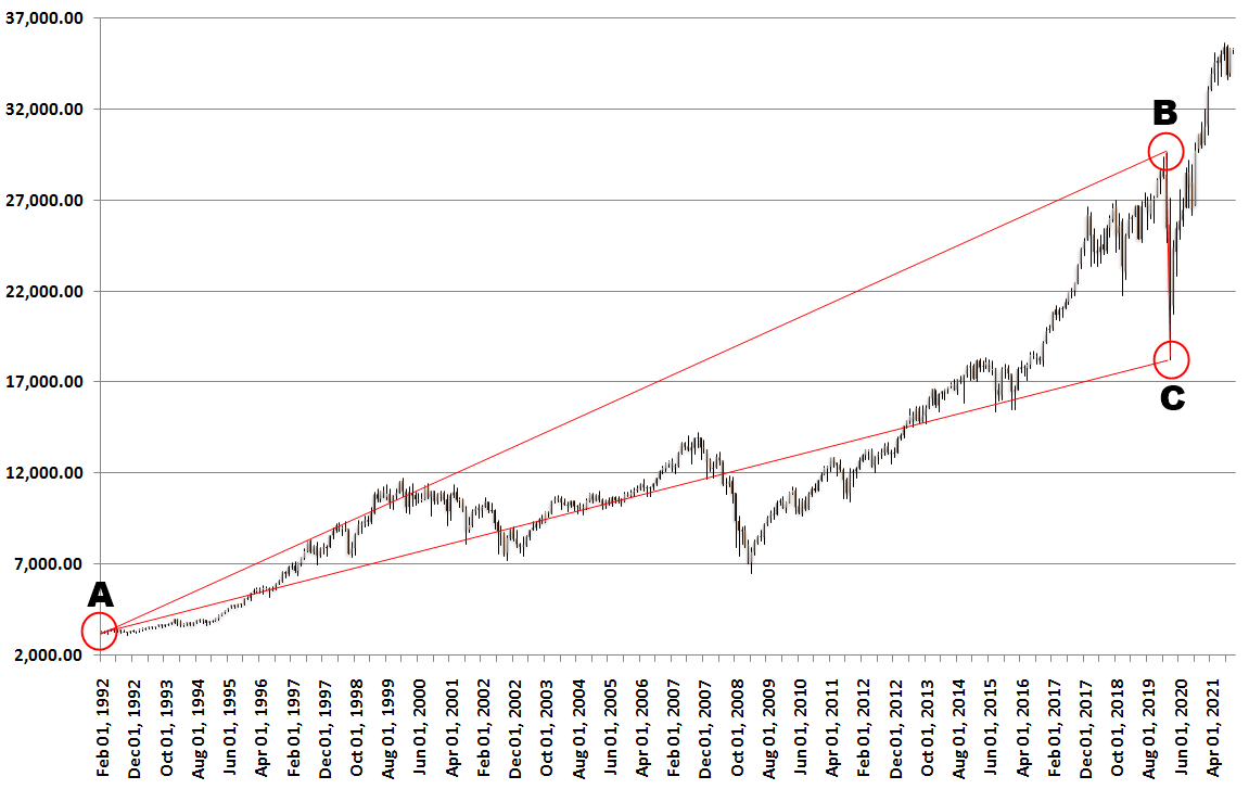
Figure 2-9: Candlestick chart of Dow Jones Industrial Average with a big cycle
In the second chart, draw small circle at the starting price at 1992 February 1 (Point 1). Draw small circle at the high price on 2007 September 1 (Point 2). From 2007 September 1, we have the subprime mortgage crisis. Hence, the price is declining sharply. In 2008 September, Lehman Brothers filed up for bankruptcy-court protection. Draw small circle at the low price on 2009 February 1 (Point 3). From 2009 February 1, the price is going up again. Draw small circle at Point B of the first chart (Point 4). Draw small circle at Point C of the first chart (Point 5). Overall, we made five points. We can create first triangle by connecting Point 1, 2 and 3. We can create second triangle by connecting Point 2, 3 and 4. We can create third triangle by connecting Point 3, 4 and 5. By comparing the two charts, we can tell, when we break the big triangle (=Point ABC), we have three small triangles (=Point 123, Point 234 and Point 345). These small triangles look similar to the big triangle. On the other hands, we can say that the big triangle is made up by combining these small triangles. It does not matter which way you think. The important things is that Dow Jones Industrial Average price is fractal. It consists of small and big fractal triangles, which are endlessly repeating. In fact, these fractal triangles appear because the market endlessly repeats the up and down movement. These fractal triangles represent the market cycles in Forex and Stock market. Each fractal triangle represents the uneven cyclic movement of the price. In general, the price analysis in the technical analysis means to make use of this knowledge of fractal triangle or fractal cycle to predict the future price movement.
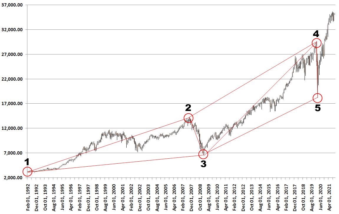
Figure 2-10: Candlestick chart of Dow Jones Industrial Average with small cycles
This second experiment with Dow Jones Industrial Average price is in fact called Peak Trough Analysis in the trading community. In fact, the peak trough analysis helps you to visualize the fractal structure inside the stock and forex market just like the iron filing helps us to visualize the fractal geometry of the magnetic field of the two magnets. Precisely speaking, the fractal structure inside the stock and forex market is fractal wave as the price is recorded in time dimension. You can conduct the same experiment using any stock market data as well as forex market data. Most of time, the peak trough analysis will confirm you that the market data shows the fractal structure. Although the peak trough analysis can be performed manually, most of time, we use the peak trough analysis done automatically by the algorithm. Most of traders use the automatic peak trough analysis in the chart to visualize fractal structure of the stock and forex market. Hence, there is no need to worry about doing this peak trough analysis manually for your trading. In addition, most of the charting platform provide an indicator or algorithm to do the automatic peak trough analysis for free to make your technical analysis faster and easier. You just need to understand what they are and how they work. Practically there are two important points with the peak trough analysis as the tool to visualize the fractal wave in the price data. Firstly, understanding the peak trough analysis will provide you the shortcut to learn all the important technical analysis developed last 100 years. Secondly, the peak trough analysis will play a crucial role from the pattern identification to setting up the profit target and stop loss for trading. In the next chapter, we will have a look at how the automated peak trough analysis works for our trading.
You can download the Dow Jones Industrical Average Price Data for Microsoft Excel below:
Dow Jones Industrial Average Excel Data
About this Article
This article is the part taken from the draft version of the Book: Technical Analysis in Forex and Stock Market (Supply Demand Analysis and Support Resistance). Full version of the book can be found from the link below:
https://algotrading-investment.com/portfolio-item/technical-analysis-in-forex-and-stock-market/
You can also use Ace Supply Demand Zone Indicator in MetaTrader to accomplish your technical analysis. Ace Supply Demand Zone indicator is non repainting and non lagging supply demand zone indicator with a lot of powerful features built on.
https://www.mql5.com/en/market/product/40076
https://www.mql5.com/en/market/product/40075
https://algotrading-investment.com/portfolio-item/ace-supply-demand-zone/
Below is the landing page for Optimum Chart (Standalone Charting and Analytical Platform).
https://algotrading-investment.com/2019/07/23/optimum-chart/
Related Products