Trading Operation with Correlation Ranking Heat Map
Article Version: 1.2
Written On: 7 March 2020
Website: www.algotrading-investment.com
1. Optimum Chart and Correlation Ranking Heat Map
Correlation Ranking Heat Map is the panel (i.e. dashboard) provided from Optimum Chart, which is the standalone charting and analytical platform. With Harmonic Pattern Scanner and Pair Trading Analyser, Correlation Ranking Heat Map provides the unique and powerful information for your trading. In this article, we will provide you the essential information you need to understand the trading operation with Correlation Ranking Heat Map. You can find more about Optimum Chart and other advanced tools inside Optimum Chart from our website below:
https://algotrading-investment.com/2019/07/23/optimum-chart/
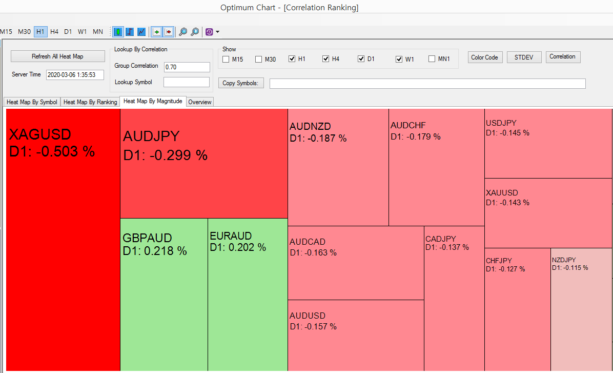
Figure 1
2. What is Correlation Ranking Heat Map
Correlation Ranking Heat Map is the mathematical tool that makes use of both correlation and price movement of individual instrument to observe the entire market movement. The ability to capture the entire market dynamics with correlation can play the role of central intelligence in your trading. In another words, Correlation Ranking Heat Map is the convenient tool for the top down decision-making for your trading.
Correlation Ranking Heat Map provides the quick view on fast gainers and losers in the market. It helps you to find the where the money is flowing in or flowing out on the day. At the same time, it provides the ability to list these gainers and losers in the ascending and descending order. Furthermore, you can also observe the group of symbols that are correlated together. For example, if you are curious about how EURUSD and other correlated symbols are doing in the market today, then you can just check such information in one button click after type the symbol name in “Lookup Symbol” box.
Correlation Ranking Heat Map creates four Heat maps for different purpose. Hence, we will explain the purpose of each Heat map one by one. Each Heat map is designed to answer some important questions for your trading. Here is the list of the questions associated with each Heat map.
1) Heat map by Symbol
- What is the performance of symbol in different timeframe?
2) Heat map by Ranking
- Where money are flowing in or flowing out most?
- What is the group performance among the correlated symbols?
3) Heat map by Magnitude
- What are the best symbols to buy or to sell?
- What are the best symbols to buy or to sell among the correlated group?
4) Overview Page
- What is the overall market sentiment?
- How much market size increased or decreased?
- How much time left before new bar arrival or market close?
3. Heat map by Symbol
Heat map by symbol provides the most basic but important information in your trading. This Heat map provides answer to the following question:
- What is the performance of symbol in different timeframe?
In Heat map by symbol, the gain and loss of each symbols are displayed in Percent (%) for different timeframe. The order of these listed symbols is the same as the order in the Market Watch in Optimum Chart. In this Heat map, you can check the ranking of each symbol according to their gain (%) and loss (%). It provides the separate rank for each timeframe.
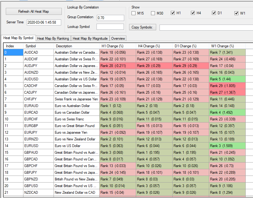
Figure 2
You can open chart directly from this Heat map if you want to perform any further analysis. This is convenient. You can open chart of each symbol for different timeframe. In doing so, use mouse right click to call the pop up menu for “Open Chart”. If you click mouse under H1 column, then it will open H1 chart for the symbol. If you click mouse under D1 column, then it will open D1 chart for the symbol. Make sure to place mouse under right column to open chart with the timeframe.

Figure 3
When you open chart from Heat map by symbol, Fractal Moving Average Indicator and Advanced Support and Resistance indicator can be opened together. These two tools are useful to decide your buy and sell entry. We will explain this later in the separate chapter.

Figure 4
4. Heat map by Ranking
Heat map by Ranking provides the most important question in our trading.
- Where money are flowing in or flowing out most?
Every trader needs to be aware on these money flows. Money flow is almost directly reflected when you watch the gain and loss of the entire symbols. In this sample screenshot, we can tell that money is flowing out from XAGUSD and AUDJPY by looking at daily timeframe column, which means people are selling on these two. At the same time, money is flowing into EURAUD and GBPAUD but the size of money flowing in is only half of the money flowing out from XAGUSD and AUDJPY. You can recognize the intensity of buy and sell pressure immediately.
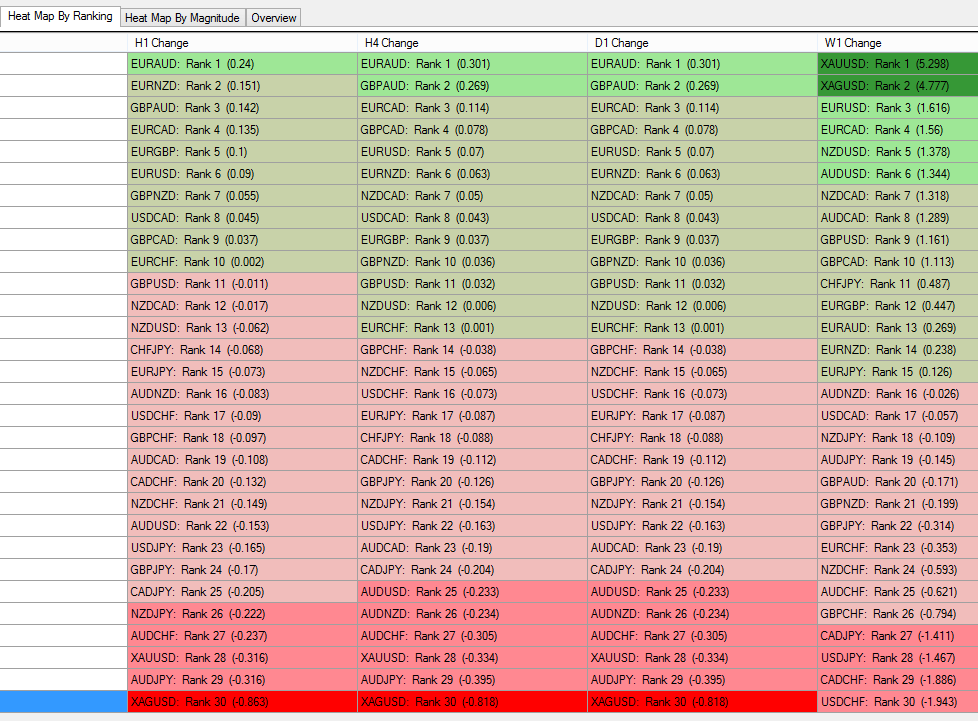
Figure 5
Another important information you need to watch out is the performance of correlated group.
- What is the group performance among the correlated symbols?
For example, if you have high interest in trading with EURUSD symbol, then it is wise to check what other correlated symbols are doing now. In doing so, type symbol name you want to look up by Correlation in the box first. Then choose sensible correlation between 0.6 and 0.85. This correlation will be used to filter out other symbols in our analysis. After clicking on Refresh All Heat Map button, it will filter out all the relevant symbols from the list. In our example, we have 7 symbols that are correlated to EURUSD. Typically, higher correlation is better. Sometimes, you get too many symbols to analyse. In that case, you can relax the correlation bit using lower correlation like 0.6 or 0.65. However, do not go down too low because low correlation does not provide any insightful information about the group performance.
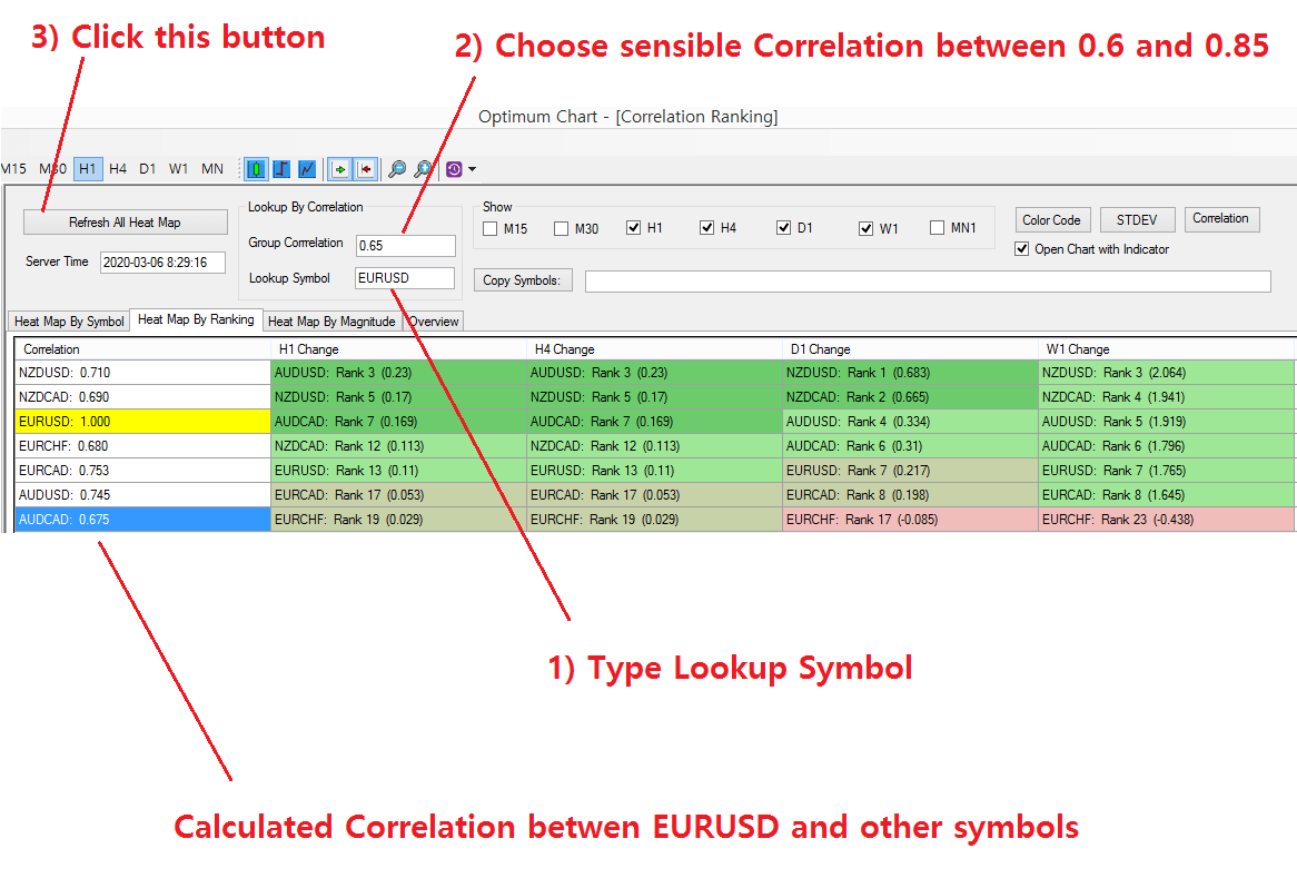
Figure 6
For further analysis, you can open chart for individual symbols. Studying the group of correlated symbols provides us more rich information about our trading direction. This is often not possible by studying just one symbol. For further demonstration, we have opened the chart for AUDUSD and EURUSD H1 timeframe. You can directly open these chart from the Heat map by Ranking. AUDUSD has 0.745 correlation with EURUSD. From the screenshot, you can tell that both EURUSD and AUDUSD are making similar price dynamics but EURUSD was leading AUDUSD. Indeed, AUDUSD is making the critical movement testing the latest supply zone. We can anticipate that AUDUSD can gain more momentum if it crosses the supply zone at its testing.
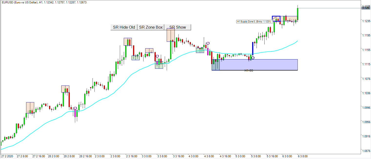
Figure 7
Various scenarios can happen in AUDUSD. However, you can tell that it is much more logical to make the trading decision by looking at the group of correlated symbols than just looking at one symbol. Likewise, you can open chart for the other correlated symbols and then you can choose easiest symbol to trade. Typically, following symbol provide you the good opportunity.
- testing supply zone
- or testing demand zone
- or cross over the Fractal Moving Average Indicator recently
- or cross down the Fractal Moving Average indicator recently
It is even better if you observe the similar behaviour in other correlated symbols.
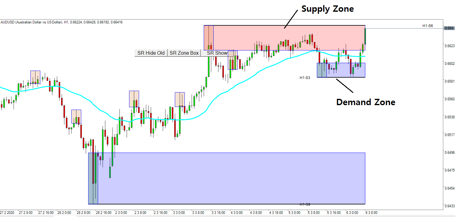
Figure 8
5. Heat map by Magnitude
Heat map by magnitude is probably the most important and frequently used heat map from Correlation Ranking Heat Map. In Heat map by magnitude, magnitude of price movement is matter. Hence, it will show you who the fastest mover in the market is. This includes both gainers and losers. Good thing is that it graphically presents the movement of each symbol. Hence, it is much easier to summarize the overall market sentiment in one look. Please note that Heat map by magnitude is only provided for Daily timeframe. This heat map can answer to the following three questions:
- What are the best symbols to buy or to sell?
- What are the best symbols to buy or to sell among the correlated group?
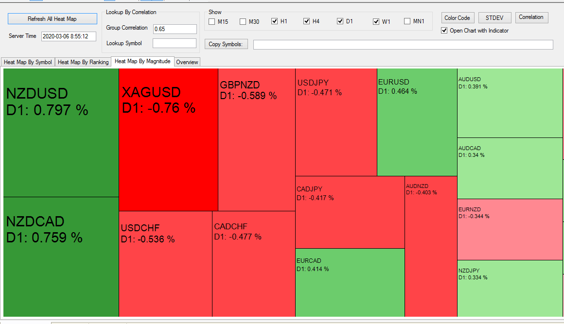
Figure 9
To use Heat map by magnitude more effectively, you have to check the elapsed time after the new daily bar was opened. Since this heat map presents the daily price movement of all symbols, it is important to use this heat map at least one or two hour after the market open. How much time elapsed after the market open can be found out on the Overview Page. In the Overview page, it provides the time elapsed after each bar open. For forex trader, it is important to check the market sentiment with the “Heat map by magnitude” for each session including Asian session, European session and USA session. You would find some interesting patterns before big reversal happens.
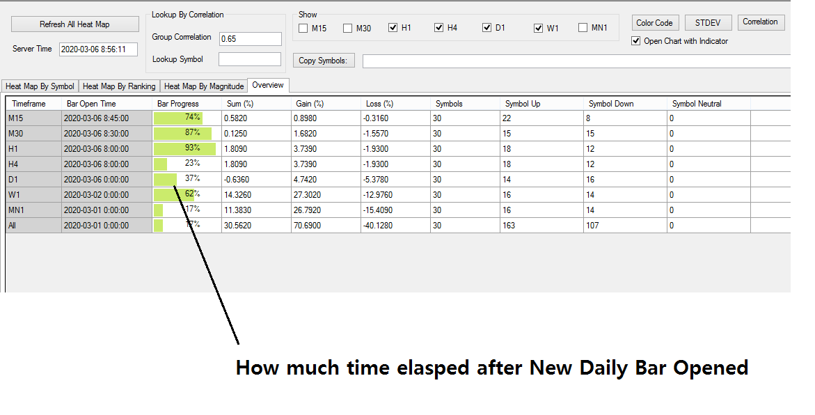
Figure 10
You can still use correlation filters to find out how the correlated group moves in this Heat map. How to do it is the same as before. Enter the symbol name in the Lookup symbol box. Then choose the Correlation value and click on Refresh All Heat Map button.
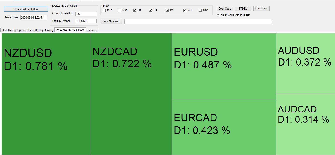
Figure 11
To complete your buy and sell trading decision, you need to open the chart. Of course, you can open the chart directly from Heat map by magnitude too. However, in this heat map, you are not able to open the chart with different timeframe. When you open chart, you can choose to open with Advanced Support and Resistance indicator and Fractal Moving Average Indicator.
6. Overview Page
Overview page is short and simple. In Overview page, you can find out answer to the following questions.
- What is the overall market sentiment?
- How much market size increased or decreased?
- How much time left before forming new bar or market close?
When you are using the four Heat map, it is important to be aware what time the heat map was created. This can be found out by checking the Bar Progress column in the Overview page. At the same time, Overview page reports how many symbols are bullish and bearish. You can quickly grab the overall market sentiment here.
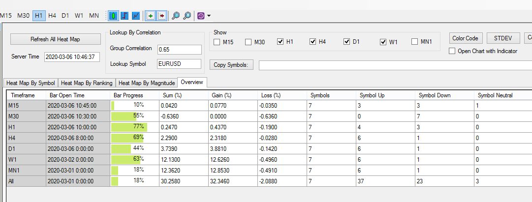
Figure 12
7. Finding Critical Buy and Sell Entry
Once, you have understood how the four Heat map work. It is time for us to find some critical entry. Correlation Ranking Heat Map provides the ability to open the chart with Advanced Support and Resistance indicator and Fractal Moving Average Indicator. We have point out that you could have the trading opportunities for the following four cases:
- testing supply zone
- or testing demand zone
- or cross over the Fractal Moving Average Indicator recently
- or cross down the Fractal Moving Average indicator recently
The additional supporting logic could be the correlation. Instead of using only one symbol, you check how other correlated symbols behave too before your final trading decision.
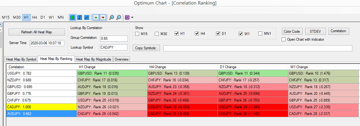
Figure 13
If you are good with reversal trading with price patterns, then you can use Harmonic Pattern Scanner together with Correlation Ranking Heat Map. Here is how to use Correlation Ranking Heat Map with Harmonic Pattern Scanner. Firstly, you need to take the list of correlated symbols from Correlation Ranking Heat Map. This can be done using Copy Symbol button.
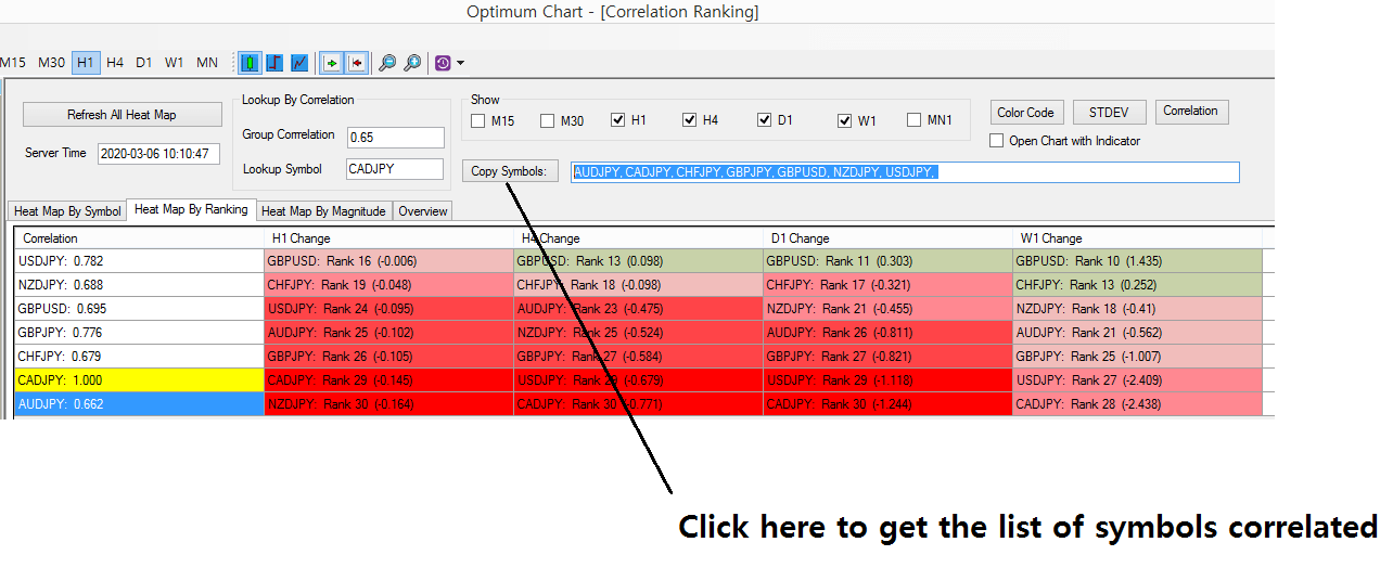
Figure 14
Then it will produce the list of correlated symbols. Now copy and paste this list to Harmonic Pattern Scanner. Then click on Lookup by Symbol button. This will only show the detected Harmonic Patterns for the correlated symbols. Rest of symbols will be filtered out. Hence, you can study harmonic patterns among the correlated symbols only.

Figure 15
You can open any chart with the detected harmonic patterns for further analysis. In addition, we provide many other powerful tools to support your trading decision. You are more than welcome to use all these tools to find the unlimited trading opportunities with Optimum Chart. Especially, Fractal pattern indicator can provide you the turning point probability in price and time. You can read more about Fractal Pattern Indicator and its turning point probability here. In this article, we provide you how to use turning point probability to perfect the Harmonic pattern, Elliott Wave pattern and X3 pattern.
- https://algotrading-investment.com/2020/01/25/fibonacci-probability-graph-little-tip/
- https://algotrading-investment.com/2020/02/20/trading-signal-with-turning-point-probability/
- https://algotrading-investment.com/2020/03/01/mother-wave-child-wave/
- https://algotrading-investment.com/2020/02/21/trading-harmonic-pattern-elliott-wave-pattern-and-x3-pattern-with-turning-point-probability/
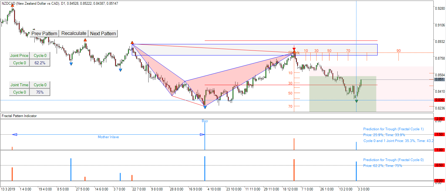
Figure 16
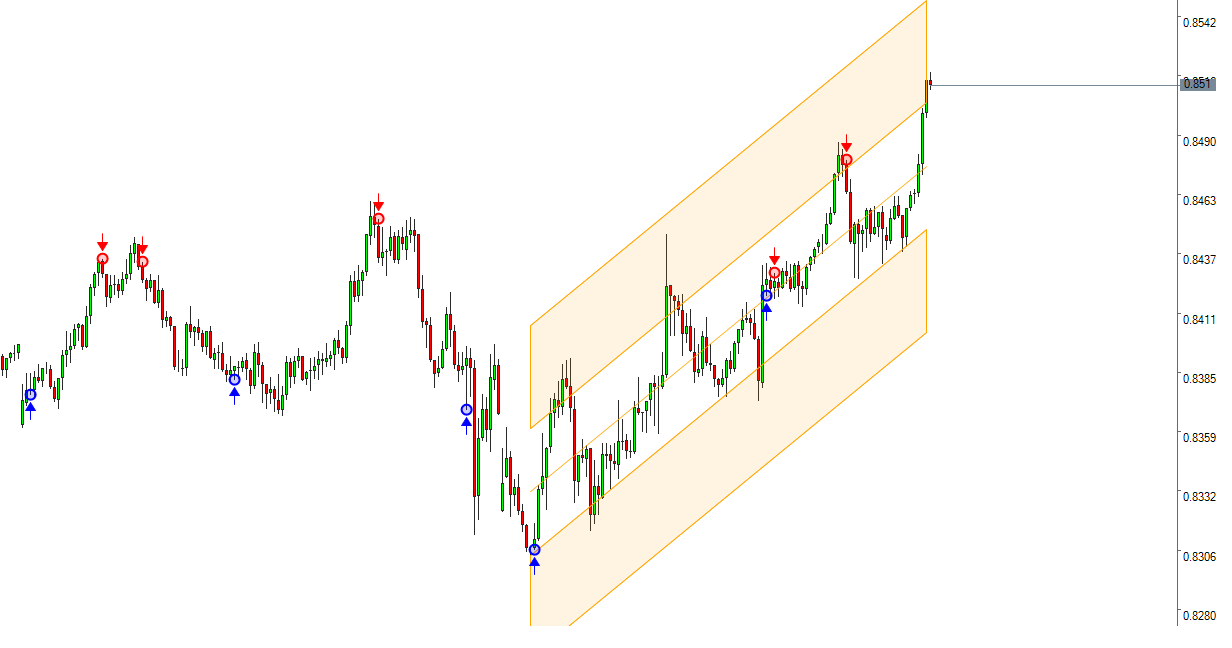
Figure 17
8. Further Note about Optimum Chart
So far, we have only covered the usage of Correlation Ranking Heat Map. Remember that Optimum Chart provides the best Harmonic Pattern Scanner and Pairs Trading Scanner, which scans buy and sell signals across all symbols and all timeframe. You can find out how to use our Harmonic Pattern Scanner and Pairs Trading Scanner in the separate articles and the books from us. We have also pointed out how to use Harmonic Pattern Scanner together with Pairs Trading with co-integration. You can make use of all of these scanners to make the best buy and sell decision.
On top of that, Optimum Chart also provides other premium trading tools, developed in house engineering lab. Besides Optimum Chart, we provide unique technical indicators and powerful trading tools for MetaTrader 4 and MetaTrader 5. Hence, we recommend you to have a look further on our website to find out the capabilities of Optimum Chart and our MetaTrader products. For your information, correlation ranking heat map is only available for Optimum Chart.
https://algotrading-investment.com/

Figure 18
Related Products